Best Color and Font Choices for Readable Real Estate Signs
Most real estate signs fail for one simple reason: they ask the viewer to read too much, too quickly, under the worst possible conditions. Passing traffic, changing light, visual clutter, and limited attention all work against the message. In that environment, color and font choice aren’t design preferences—they’re performance variables.
The human eye processes contrast and shape before it ever reads a word. If a sign doesn’t stand out immediately, it doesn’t get a second chance. This is why some real estate signs are instantly recognizable from the street, while others disappear into the background—even when they’re placed in the same yard.
In this science spinoff, we break down how color contrast and typography affect real-world sign readability. Using real examples, drive-by perspective, and visual comparisons, we’ll show why simpler layouts outperform crowded designs, which color combinations work best at a distance, and how font weight and size determine whether a sign is readable or ignored.
Because when a sign is only seen for a few seconds, clarity isn’t optional—it’s everything.
If you’ve already explored how sign size affects visibility, this next variable builds directly on that foundation.
In Science Spinoff #1, we looked at how real estate sign size impacts visibility at a distance. Size determines whether a sign can be seen—but color and font determine whether it can be understood. Even a perfectly sized sign will fail if its message blends into the background or collapses at a glance.
This spinoff focuses on what happens after a sign enters the viewer’s field of vision: how the eye processes contrast, color, and letterforms in real-world conditions. If you’re just joining the series, our cornerstone guide on the science behind real estate signs that actually get noticed breaks down the core principles that influence visibility, readability, and buyer recall.
1. How the Human Eye Processes Signs at a Glance
Before a driver ever reads a word on a sign, their brain makes several split-second decisions. Is this object important? Does it stand out from its surroundings? Is it worth paying attention to?
The human visual system prioritizes contrast, shape, and motion first. Text recognition comes later—often milliseconds later, but in drive-by scenarios, that delay matters. If a sign doesn’t create immediate contrast against its environment, the brain dismisses it before the message is ever processed.
This is why high-contrast real estate signs consistently outperform softer, more decorative designs. Bold color separation allows the eye to lock onto the sign quickly, while clear letterforms help the message register before the viewer moves on. Thin fonts, low-contrast color combinations, and overly complex layouts force the brain to work harder—something it simply won’t do at speed.
In practical terms, this means real estate signage must be designed for recognition first, reading second. A sign that is technically readable up close can still fail entirely from the street if contrast and typography aren’t doing their job immediately.
2. Contrast & Color Psychology at a Distance
Once a sign enters the viewer’s field of vision,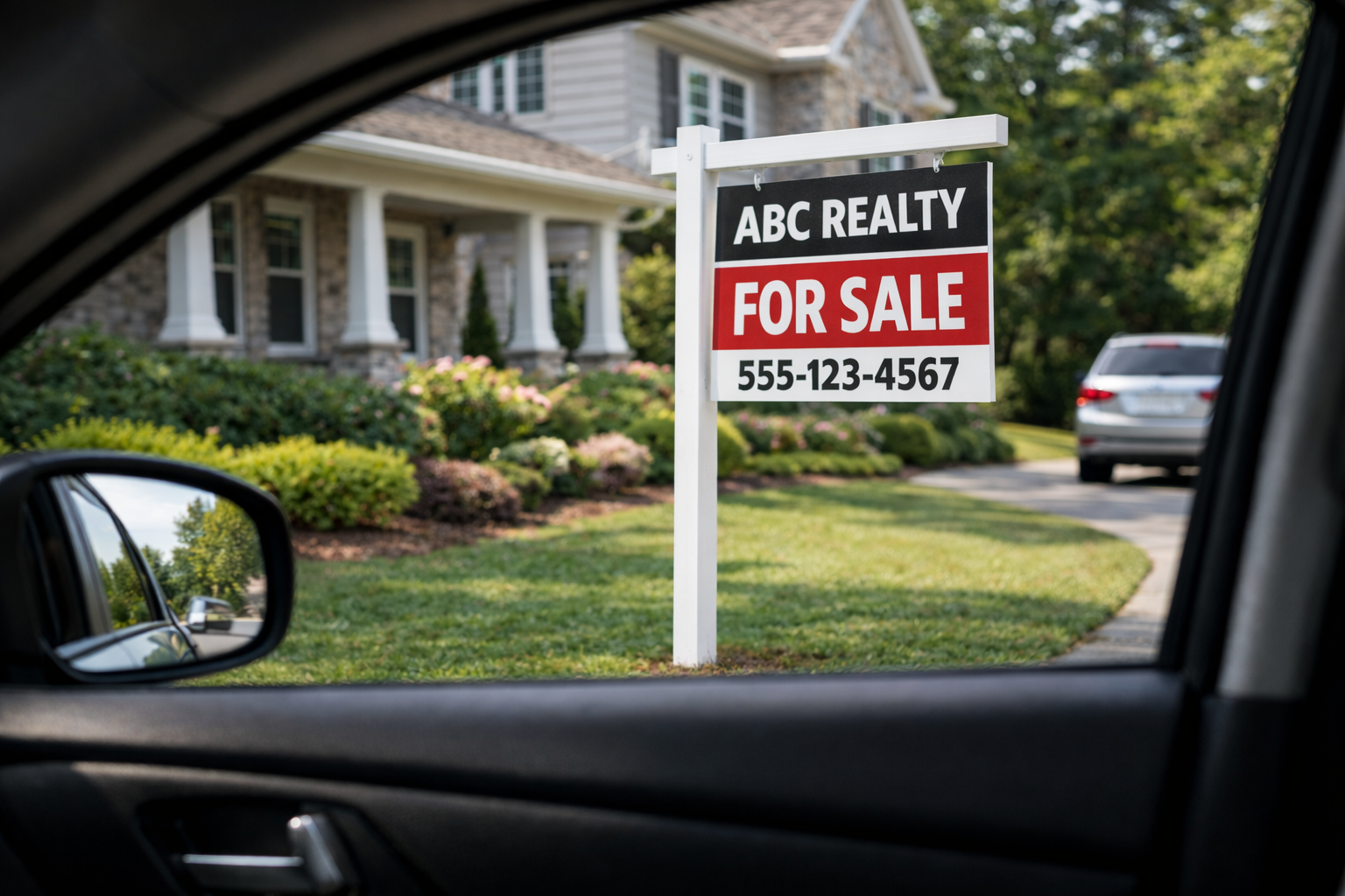 contrast becomes the single most important factor in whether the message is understood. Color is not about aesthetics in this context—it’s about separation. Strong contrast between background and text allows the eye to identify the sign instantly, even in cluttered environments.
High-performing real estate signs rely on proven contrast pairings such as dark text on a light background or light text on a dark background. These combinations remain legible across changing conditions like glare, shade, dusk, and visual noise from trees, vehicles, and surrounding homes.
Softer palettes, muted tones, and low-contrast brand colors often look appealing on a screen but lose effectiveness outdoors. When contrast is weak, the sign blends into its surroundings, forcing the viewer’s brain to work harder. In drive-by situations, that effort rarely happens.
The takeaway is simple: if the sign does not visually separate itself from the environment immediately, the message is lost before it is ever read.
↑ Back to top
3. Typography: Size, Weight, and Readability
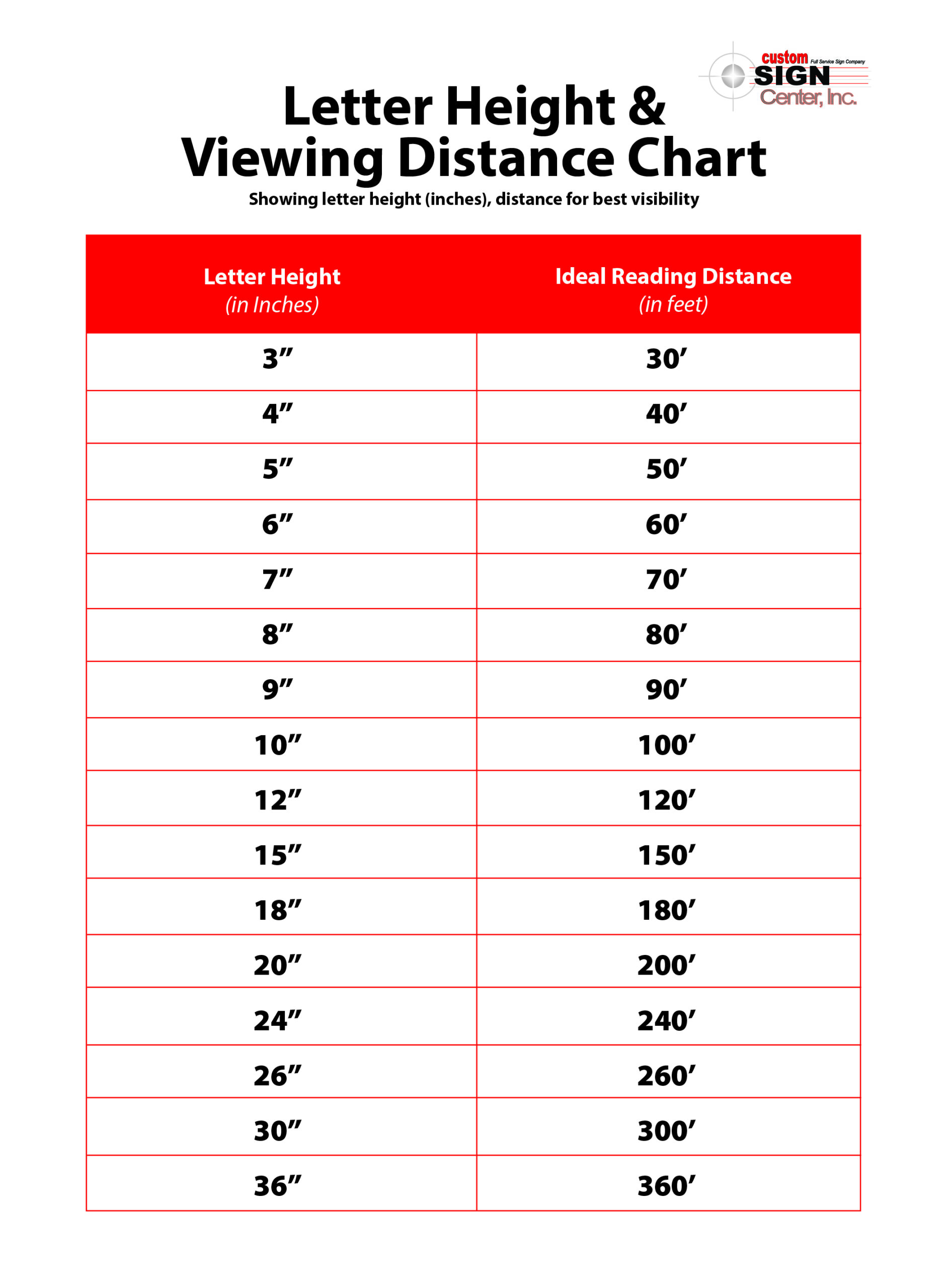 Font choice in real estate signage is not about style—it’s about speed. Viewers need to recognize and process text in seconds, often while moving. Thin fonts, decorative typefaces, and condensed letterforms reduce legibility and slow comprehension.
Bold, sans-serif fonts consistently perform best for outdoor signage. Their clean lines and uniform stroke weight make letters easier to distinguish at a distance. Adequate spacing between letters and lines also plays a critical role, preventing characters from blending together when viewed quickly.
Font size matters just as much as font style. Text that is technically readable up close may fail entirely from the street. Signs should be designed with viewing distance and vehicle speed in mind, prioritizing the most important information first and eliminating unnecessary text. Font choice deserves special attention, especially for outdoor signage viewed at speed. We break that down in detail here.
↑ Back to top
4. Information Hierarchy: What Actually Belongs on a Sign
Effective real estate signs follow a clear visual hierarchy. The viewer’s eye should know exactly where to look first, second, and third—without confusion. When too many elements compete for attention, nothing stands out.
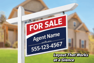
The most important message—such as “For Sale” or the agent’s brand—should dominate the layout. Secondary details like phone numbers or URLs should support the message, not compete with it. Extra slogans, social icons, certifications, and excessive imagery often dilute impact rather than add value.
A sign’s job is not to tell the whole story. Its purpose is to spark recognition and prompt the next action. Everything else can wait until the viewer reaches a website or listing page.
↑ Back to top
5. Common Real Estate Sign Mistakes (And Why They Fail)
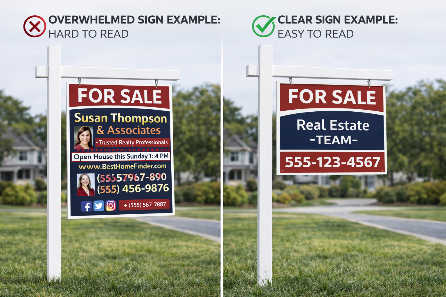 Many real estate signs fail not because of poor placement, but because of overdesign. Crowded layouts, multiple fonts, low-contrast color choices, and excessive information force the viewer to process too much too quickly.
When a sign overwhelms the eye, the brain disengages. Instead of scanning the message, the viewer moves on. This is why simpler signs consistently outperform complex ones, even when the simpler design appears less “creative.”
Clarity always wins. A sign that communicates one message clearly will outperform a sign that tries to communicate five.
↑ Back to top
6. Placement and Post Height Matter More Than You Think
Even a well-designed sign can fail if it is poorly placed. Height, angle, and setback all influence visibility. Signs positioned too low are more easily blocked by vehicles, landscaping, or changes in terrain.
Standard six-foot posts elevate the sign into a cleaner sightline, improving visibility from both directions of traffic. Proper placement also reduces visual competition, allowing the sign to stand apart from its surroundings rather than blend into them.
Design and placement work together. One cannot compensate for the other.
↑ Back to top
7. Materials and Durability as Trust Signals
The physical quality of a sign sends an unspoken message. Warped panels, faded prints, and flimsy materials undermine credibility, even if the design itself is strong.
Rigid materials, clean edges, and durable finishes signal professionalism and attention to detail. In real estate, these subtle cues influence perception. A sign that looks temporary or poorly maintained can reflect negatively on the listing it represents.
Durability is not just a production concern—it is part of the message.
Design for the Moment You’re Actually Seen
 Real estate signs are not read carefully—they are interpreted instantly. Most viewers encounter them in motion, under imperfect lighting, and surrounded by visual noise. In those conditions, design choices stop being subjective and start becoming measurable.
Color contrast determines whether a sign separates from its environment. Font weight and size determine whether the message can be understood before the moment passes. When either element fails, the sign may still exist physically, but it no longer functions.
The most effective real estate signs respect how the human eye works. They prioritize clarity over decoration, recognition over detail, and function over trends. These signs do not compete for attention—they command it quietly and confidently.
When a sign is designed for real-world conditions rather than a screen, it becomes more than a marker. It becomes a reliable extension of the agent’s brand, working continuously to reinforce credibility, visibility, and trust.
In an environment where every second counts, clarity is not a design choice—it is the difference between being seen and being ignored.

0 Comments