This article expands on the typography principles introduced in our earlier discussion on color and font fundamentals. If you haven’t read that section yet, we recommend starting with our overview of color and typography in real estate signage before diving deeper here.
Why Font Choice Deserves Its Own Deep Dive
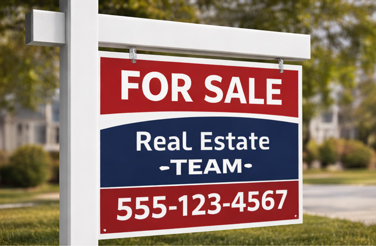 Font choice matters just as much as color when it comes to real estate signage. Text that is technically readable up close may fail entirely from the street, especially when signs are viewed at speed from a moving vehicle.
Even with proper letter size, the wrong font can slow recognition, reduce clarity, and cause the message to be skipped altogether. That’s why typography for outdoor signage deserves closer examination.
This follow-up takes a deeper look at how fonts perform in real-world conditions where distance, motion, glare, and limited attention all come into play.
The Brain Doesn’t Read Signs—It Recognizes Them
When someone passes a real estate sign, their brain doesn’t read letter by letter. Instead, it recognizes shapes, spacing, and contrast, then assigns meaning almost instantly. That recognition window is measured in fractions of a second. If the typography requires extra effort to interpret, the opportunity is gone before the message lands.
Typography either accelerates recognition or quietly works against it.
↑ Back to top
Serif vs. Sans Serif: What Works at Speed
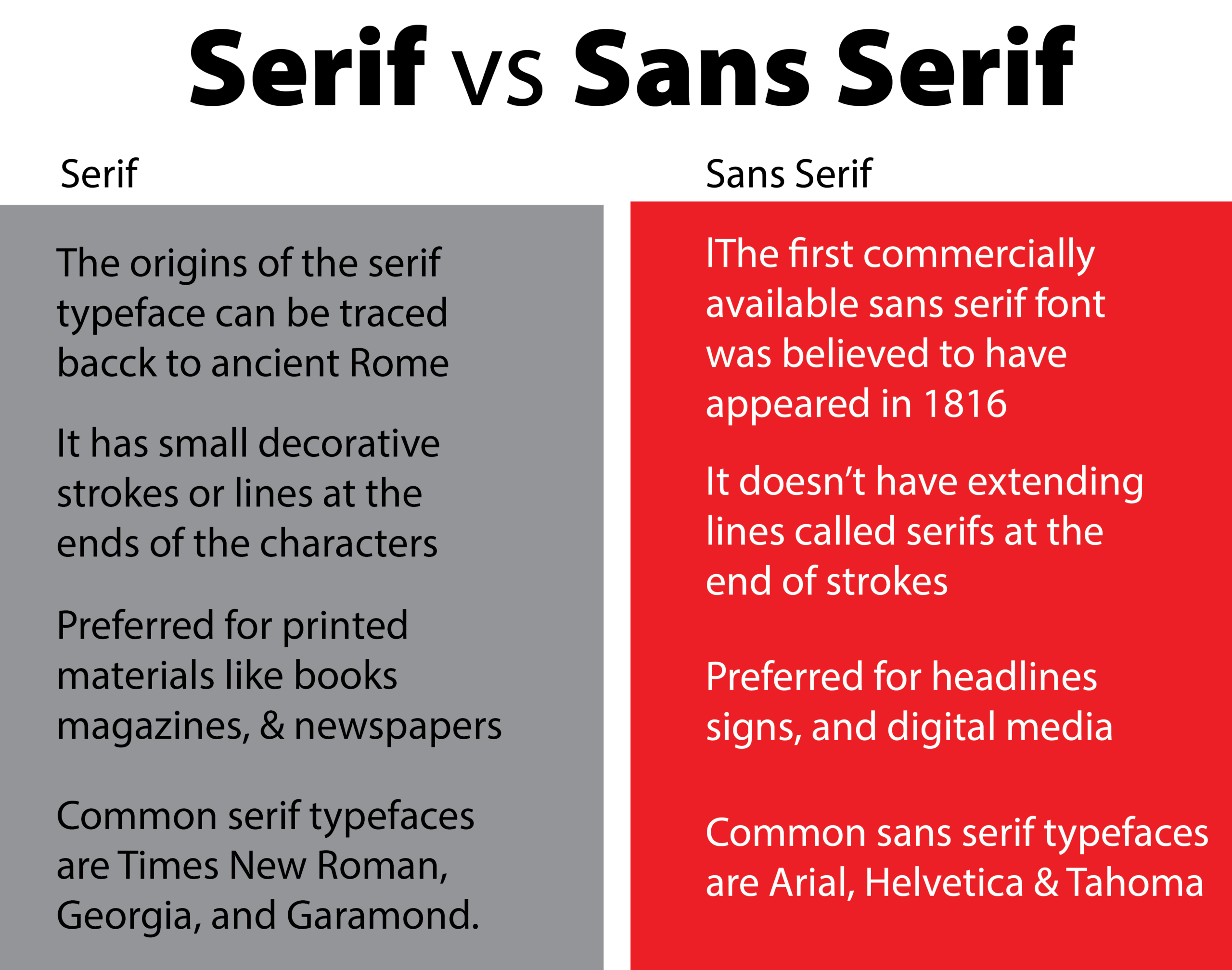
Serif Fonts
Serif fonts include decorative strokes at the ends of letters. While effective for books and long-form reading, those details become visual noise outdoors. At distance or speed, serif fonts tend to blur, lose clarity under glare, and reduce instant recognition. They may feel traditional, but tradition doesn’t help if the message isn’t absorbed.
Sans Serif Fonts
Sans serif fonts remove decorative elements, leaving clean letterforms that hold their shape in real-world viewing conditions. They remain legible at distance, perform better in changing light, and are easier to recognize from moving vehicles. This is why highway signs, wayfinding systems, and effective outdoor signage overwhelmingly rely on sans serif typography.
Font Weight Is the Hidden Variable
Even the right font family can fail if the weight is too light. Thin fonts break apart visually at distance, fade against bright backgrounds, and lose definition when viewed in motion. Bold or semi-bold fonts maintain their structure, improve recognition speed, and survive glare, shadow, and weather. For signs read from the street, thin fonts are not a stylistic risk—they are a functional one.
↑ Back to top
Safe-Default Fonts for Outdoor Real Estate Signs
When readability is the priority, these fonts consistently perform well across materials and outdoor environments.
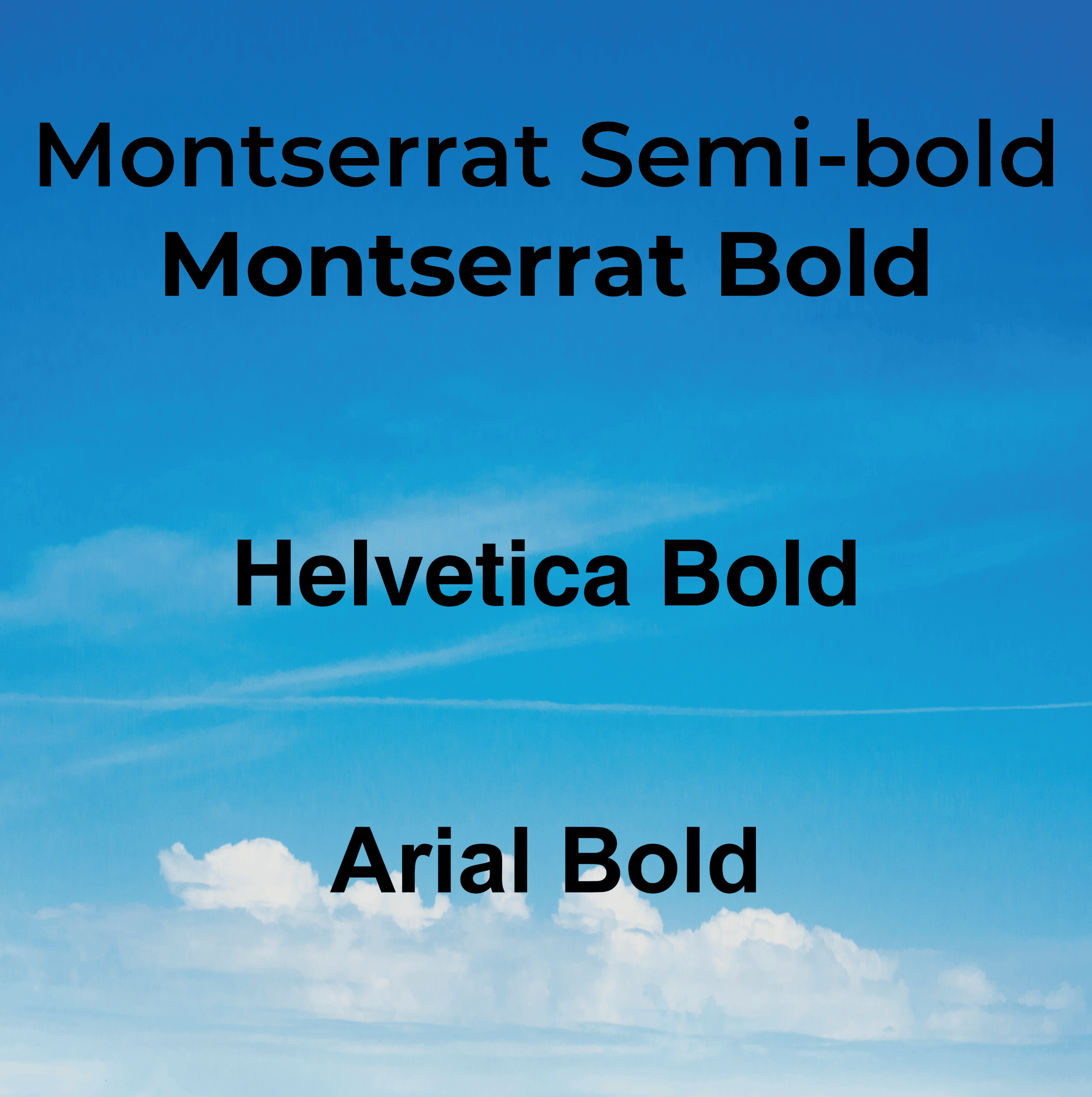 Montserrat (Bold or Semi-Bold)
A modern sans serif with wide letterforms and generous spacing. It balances clarity with a contemporary look, making it ideal for residential listings and team branding.
Helvetica (Bold)
Neutral, authoritative, and highly legible. A long-standing standard for signage and wayfinding systems.
Arial (Bold)
Simple and dependable. It renders consistently across systems and prints cleanly without surprises.
Typography Supports Brand—But Readability Comes First
Once legibility is secured, typography can reinforce brand tone. Rounded fonts feel approachable, condensed fonts feel efficient, and wider fonts feel stable and established. But personality only works if the message lands. If a sign can’t be read instantly, brand expression never gets a chance.
The Rule to Remember
If it can’t be read instantly at a distance, it doesn’t belong on a real estate sign.
Fonts aren’t decoration. They’re infrastructure. They decide whether a sign communicates—or disappears.
↑ Back to top
This article is part of our ongoing series exploring the science behind real estate signs that actually sell homes. For a complete overview of how design, color, typography, size, and layout work together, read our full guide to the science behind real estate signs.


0 Comments