Real estate signs haven’t disappeared. They haven’t become obsolete. And they certainly haven’t been replaced by digital ads. In fact, when done correctly, a real estate sign is still one of the highest-ROI marketing tools an agent can use. It works 24/7. It builds brand recognition passively. And it influences buyers and sellers long before a conversation ever happens.
So why do so many signs fail?
- It’s rarely the material.
- It’s rarely the price.
- And it’s almost never because “signs don’t work anymore.”
Most signs fail because they were designed without strategy. They’re built on preferences instead of purpose. On trends instead of performance. On copying what everyone else is doing instead of understanding why certain signs actually drive calls, recognition, and trust. After decades of designing and producing real estate signage for professionals across a wide range of markets, one thing has become very clear:
Great real estate signs are not accidental.
They are engineered.
This guide breaks down the five core principles behind real estate signs that consistently outperform the rest—not based on opinion, but on visual behavior, brand psychology, and real-world experience.
Table of Contents
- Secret #1: Audience Beats Aesthetics Every Time
- Secret #2: Color Is a Performance Tool, Not a Preference
- Secret #3: Fonts Can Make or Break Your Sign in 50 Feet
- Secret #4: Information Hierarchy Matters More Than Information Quantity
- Secret #5: Layout Is Where Strategy Becomes Conversion
- Real-World Results: Why Consistent Sign Systems Win
- How to Apply This Without Being a Designer
- Conclusion: Great Signs Don’t Happen by Accident
Secret #1: Audience Beats Aesthetics Every Time
One of the most common mistakes in real estate sign design is aiming for universal appeal.
- “I want it to work for everyone.”
- “I don’t want to limit myself.”
- “I just want it to look nice.”
That mindset is understandable—but it’s also the fastest way to create a sign that blends into the background. Effective real estate signs are not designed to please everyone. They are designed to resonate instantly with the right people.
Your Sign Is Talking—Who Is It Talking To?

A real estate sign communicates more than availability—it signals results and speaks directly to the audience it’s meant to attract.
Every neighborhood tells a story. Every listing sends a signal. And every sign communicates far more than just a phone number. Before color, before fonts, before layout, the most important design question is this:
Who do you want this sign to attract?
- First-time buyers vs. luxury buyers
- Fast-moving family neighborhoods vs. high-end enclaves
- Sellers evaluating professionalism vs. buyers browsing casually
Trying to speak to all of them at once usually results in speaking clearly to none of them.
The Rifle Approach Always Wins
Designing for everyone is the shotgun approach—wide, loud, and unfocused. Designing for a specific audience is the rifle approach—precise, intentional, and effective.
When agents clarify their niche, something powerful happens:
- Their signs become instantly recognizable
- Their branding becomes consistent
- Their marketing starts working for them instead of competing for attention
The goal isn’t exclusion. The goal is clarity. Clear signs are trusted faster. Trusted signs get remembered. And remembered signs get calls.
Attraction Is Strategic, Not Personal
There’s a natural temptation to choose colors, layouts, and styles based on personal taste. But the most effective real estate professionals understand a critical distinction:
Your sign is not for you. It’s for your audience.
When design decisions are guided by who you want to work with—rather than what you personally like—your signage stops being decorative and starts becoming directional. That’s when it does its real job: attracting the right buyers, the right sellers, and the right opportunities.
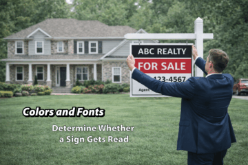
Secret #2: Color Is a Performance Tool, Not a Preference
Color is one of the most misunderstood elements of real estate sign design.
Too often, it’s treated as a matter of taste:
- “I like blue.”
- “This feels modern.”
- “That color is trending right now.”
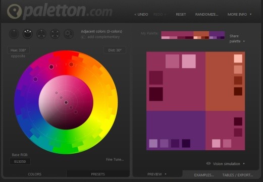 But effective signage doesn’t operate on trends or personal preference. It operates on visibility, contrast, and recognition.
In other words, color isn’t decoration—it’s a performance tool.
Contrast Is the Real Hero
The single most important color principle in signage is not harmony or trendiness. It’s contrast. If a sign cannot be read quickly and effortlessly—often from a moving vehicle—it has already failed its job. High contrast between background and text allows the human eye to process information faster and with less effort.
Low contrast may look sophisticated up close. At 40 feet, it looks like a mistake.
The most effective real estate signs prioritize:
- Dark text on light backgrounds, or vice versa
- Clear separation between brand elements and information
- Consistency across panels, riders, and listings
When contrast is strong, comprehension is instant. When comprehension is instant, attention follows.
Recognition Beats Reinvention
Strong real estate branding isn’t built by constantly changing colors. It’s built through repetition. When the same color palette appears again and again—across listings, neighborhoods, and seasons—it begins to work subconsciously. People may not remember a name right away, but they remember the look.
That’s how recognition is born. Over time, the most successful agents don’t need louder signs. They need familiar ones.
Color Should Support the Message—Not Compete With It
The purpose of color is to support what matters most:
- Who you are
- What you’re offering
- How to reach you
When color choices overpower the message, attention scatters. When color supports hierarchy and clarity, the sign does the heavy lifting quietly and effectively. The best real estate signs don’t shout. They signal.
Secret #3: Fonts Can Make or Break Your Sign in 50 Feet
Fonts are another design element that often get chosen emotionally instead of strategically. Script fonts feel elegant. Thin fonts feel modern. Decorative fonts feel unique. But signage doesn’t exist to express personality—it exists to communicate at distance.
Readability Always Wins
A sign only has a few seconds—sometimes less—to be understood. That means every letter must work hard.
Effective real estate signs use fonts that:
- Are legible from long distances
- Maintain clarity at speed
- Hold up in varying light conditions
As a general rule, letters around 3 inches tall can be read clearly from 30 feet and beyond. Thin strokes, tight spacing, and overly decorative styles reduce that range dramatically. If someone has to slow down or squint, the sign has already lost.
Fewer Fonts, Better Results
Using multiple fonts rarely improves a sign. In most cases, it creates visual noise.
The most effective designs rely on:
- One primary font family
- Multiple weights (regular, bold, heavy)
- Clear hierarchy through size and spacing
This keeps the message cohesive and easy to process. The eye knows where to go—and what matters most.
Script Fonts: Use With Caution
Script fonts aren’t forbidden—but they should be used sparingly and intentionally. When readability suffers, elegance becomes a liability. If a font cannot be read quickly from across the street, it does not belong on a real estate sign. Professionalism is communicated through clarity, not complexity.
 Secret #4: Information Hierarchy Matters More Than Information Quantity
One of the fastest ways to weaken a sign is to overload it. More information does not equal more effectiveness. In fact, it usually produces the opposite result.
The Three-Second Rule
Most real estate signs are scanned, not studied. That means viewers subconsciously decide—within a few seconds—whether the sign is worth paying attention to. During that time, only the most important information will register.
Effective signs prioritize:
- Who (brand or agent name)
- Action (how to make contact)
- Support (secondary details or compliance elements)
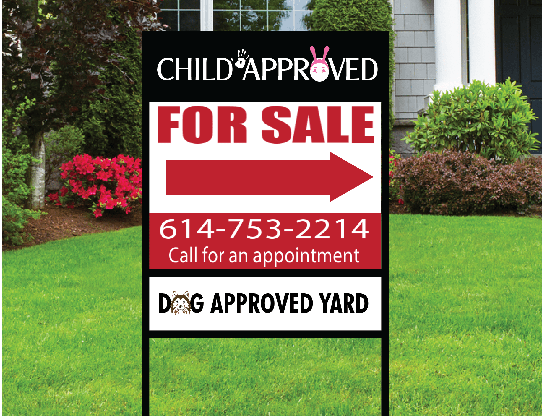
A real estate sign with multiple competing messages shows why clear information hierarchy is essential for fast readability and better results.
Everything else is optional.
Less Is Not Lazy—It’s Strategic
Removing nonessential elements improves clarity and confidence. A clean sign feels intentional. A cluttered sign feels uncertain.
When information is clearly prioritized, the sign feels professional—even understated. And understated confidence tends to attract attention far more effectively than visual noise.
Good hierarchy doesn’t just improve readability. It improves trust.
Secret #5: Layout Is Where Strategy Becomes Conversion
Layout is the silent force behind every effective sign. It determines where the eye goes first, what gets remembered, and what gets ignored.
The Rule of Thirds Still Works—Because People Haven’t Changed
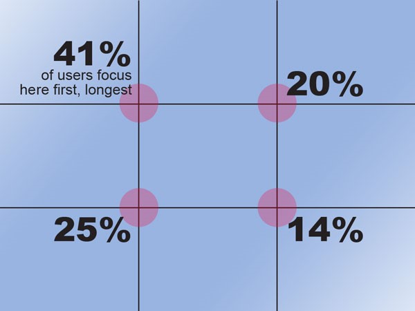
Design that follows human eye movement.
Human visual behavior hasn’t changed just because technology has. The way eyes move across space is still remarkably consistent. Design frameworks like the rule of thirds work because they align with how people naturally scan information:
- Top-left areas tend to receive attention first
- Visual flow follows predictable paths
- Clear spacing improves retention
Placing the most important elements in the strongest visual zones increases the likelihood they’ll be seen—and remembered.
White Space Is Not Wasted Space
White space (or negative space) gives the design room to breathe. It separates ideas, improves legibility, and makes important elements stand out.
Crowded signs don’t feel busy—they feel confusing. And confusion never converts.
Design Should Reduce Effort, Not Demand It
The best layouts feel effortless. They guide the eye smoothly from one element to the next without friction. When layout supports hierarchy and clarity, the sign does its job quietly and effectively—without asking for extra attention. That’s where strategy becomes results.
Real-World Results: Why Consistent Sign Systems Win
In real estate, consistency isn’t about aesthetics — it’s about recognition. When signs follow a consistent system in size, layout, and visual hierarchy, they become easier to spot and faster to understand. Over time, that familiarity builds trust and improves response, even before a buyer consciously processes the message.
Inconsistent sign sizes and layouts create friction. Viewers are forced to re-learn how to read each sign, which slows comprehension during an already brief window of attention. Consistent systems remove that friction. The message becomes predictable, readable, and easier to process at speed.
Sign size is a key part of that system. Using the same panel size everywhere may feel consistent, but it often ignores real-world conditions like traffic speed, viewing distance, and placement. Choosing the right size for each environment allows signs to remain cohesive while still performing effectively.
We explore this relationship between sign size, placement, and visibility in more detail in our Science Spinoff on choosing the right real estate sign size for visibility, where real-world conditions are broken down into practical guidance.

Seeing the same sign design repeatedly in the same area builds familiarity, which plays a key role in trust and long-term brand recognition.
Recognition Builds Before Trust—And Trust Drives Action
Buyers and sellers rarely interact with a sign just once. They see it repeatedly—on different streets, in different neighborhoods, across multiple listings. Each exposure reinforces recognition. That recognition creates comfort. Comfort creates trust. And trust lowers resistance. By the time someone finally needs an agent, the decision often feels pre-made. That’s not luck. That’s consistency at work.
Consistency Compounds Over Time
A single great sign can look professional. A consistent sign system builds a brand. Agents who standardize their signage—panels, riders, layouts, colors, and fonts—benefit from cumulative visibility. Each listing supports the next. Each sign strengthens the last. Instead of starting from zero every time, their marketing compounds. That’s why top-producing agents rarely redesign their signs every year. They refine. They reinforce. They repeat what works.
Systems Reduce Effort—and Errors
Consistency isn’t just about branding. It’s also about efficiency. When signage is standardized:
- Decisions are faster
- Design mistakes are reduced
- Ordering becomes simpler
- Results become more predictable
The goal isn’t perfection. The goal is repeatable success.
How to Apply This Without Being a Designer
You don’t need a design degree to create effective real estate signs. What you need is a system—and the discipline to stick to it.
Start With Proven Frameworks
Professional templates exist for a reason. They’re built around readability, hierarchy, and balance. Using a well-designed template removes guesswork and prevents common mistakes before they happen. The smartest approach isn’t reinventing the wheel. It’s starting with a wheel that already works.
Make a Few Decisions—Then Stop Re-Deciding
Choose your:
- Core color palette
- Primary font family
- Standard layout structure
Once those decisions are made, commit to them.
Constant tweaking feels productive, but it often undermines recognition. Consistency wins not because it’s exciting—but because it’s effective.
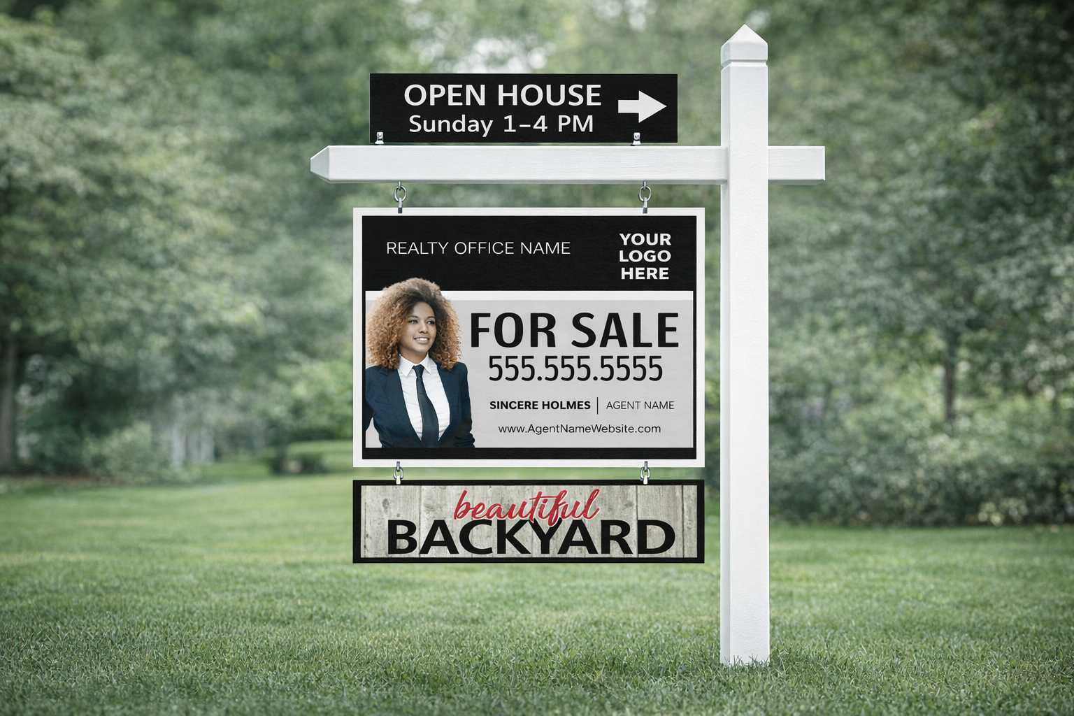
Think in Packages, Not Pieces
Signs work best when they’re designed as a set:
- Main panels
- Riders
- Directional signs
When these elements are planned together, the result is cleaner, more professional, and easier to manage long-term. A package approach also makes it easier to scale your marketing without redesigning every time a new listing goes live.
When in Doubt, Simplify
If a design decision feels uncertain, simplify it. Remove an element. Increase contrast. Improve spacing. Clarity is almost always the right answer. Great signs don’t demand attention—they earn it by being easy to understand.
If you’re ready to apply these principles to your own signage, working with a professional sign partner can help ensure every detail—from layout to materials—is done right the first time.
614-279-6035 | Careteam@customsigncenter.com
Conclusion: Great Signs Don’t Happen by Accident
The most effective real estate signs aren’t trendy. They aren’t complicated. And they certainly aren’t accidental. They’re built on clear strategy, consistent systems, and an understanding of how people actually see and process information. When signs are designed this way, they stop being disposable marketing tools—and start becoming long-term brand assets.
That’s the difference between printing signs and engineering outcomes.


1 Comment
The Future of Signage: Why Printed Signs Still Matter - The Power of Signs · January 22, 2026 at 3:20 pm
[…] Bottom line: Physical signage isn’t going anywhere. It’s expanding. The staying power of physical signage isn’t nostalgia—it’s rooted in how people see, process, and remember information in the real world. We break this down further in our article on the science behind real estate signs that actually sell homes. […]