Layout is not decoration. It’s decision architecture.
In The Science Behind Real Estate Signs That Actually Sell Homes, we introduced layout as the silent force behind every effective sign. Here’s the deeper truth: layout doesn’t just influence what people see—it determines how quickly they understand, and whether they act at all.
This is where visual science stops being theoretical and starts producing results.
Why the Rule of Thirds Still Works (and Always Will)
Design trends evolve. Human vision does not.
Eye-tracking studies consistently show that viewers scan visual information in predictable patterns. These patterns aren’t cultural or generational—they’re biological. That’s why principles like the rule of thirds continue to outperform trend-driven layouts.
When applied to signage, this means:
-
The top-left zone often receives first attention
-
The eye naturally follows structured visual paths, not chaos
-
Elements placed in dominant visual zones are remembered longer
Placing the brokerage name, key message, or call to action in these high-attention zones isn’t a design preference—it’s a visibility advantage.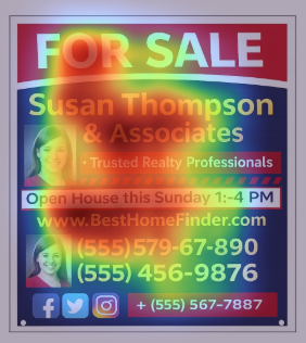
Design that respects how eyes move reduces cognitive friction. And less friction means faster comprehension.
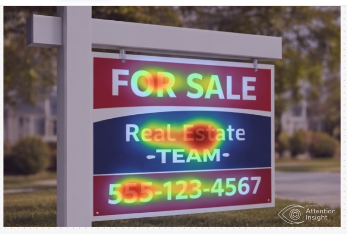
Every sign is asking the viewer to answer three questions, in order: What is this? Is it relevant to me? What should I do next? A strong layout answers those questions without forcing the viewer to think about them. That’s hierarchy at work. Size, spacing, alignment, and grouping tell the brain what matters most. When hierarchy is clear, the viewer doesn’t analyze the sign—they absorb it. When hierarchy is unclear, the brain stalls. And stalled brains don’t convert. One of the most misunderstood layout tools is white space. White space: Separates ideas Improves legibility at distance Makes key elements feel intentional Crowded signs don’t look “full.” They look uncertain. They signal that nothing was prioritized, so the viewer shouldn’t prioritize it either. In real-world conditions—drive-bys, poor lighting, visual clutter—white space becomes even more critical. It’s what allows a sign to stay readable when conditions are less than ideal. The best layouts don’t draw attention to themselves. They disappear, letting the message do the work. When layout supports hierarchy, spacing, and natural eye movement: The sign feels effortless to read The message feels obvious, not forced The call to action feels like the natural next step That’s not accidental. That’s strategy executed visually. Fonts attract interest. And clarity is what turns a passing glance into recognition—and recognition into response. This is why layout sits at the center of effective sign design. It’s the point where intention becomes understanding, and understanding becomes action. In the next spinoff, we’ll tackle a common mistake that undermines even well-laid-out signs: overloading the message and trusting the viewer to sort it out. (Spoiler: they won’t.) Great layout isn’t something people notice. It’s something they understand. The science behind effective signage keeps pointing to the same truth: the human brain is efficient, selective, and impatient. When a sign respects that—by using clear hierarchy, intentional spacing, and predictable visual flow—it becomes easy to process at a glance. And ease is what drives response. The examples in this article show the contrast clearly. Clean layouts allow attention to settle naturally on what matters most. Overloaded layouts force the brain to work harder, fragmenting attention and diluting the message. The difference isn’t taste or trend—it’s cognitive effort. This is where strategy becomes conversion. Not through louder colors or more information, but through restraint. Through choosing what not to include. Through letting layout quietly guide the viewer without demanding their focus. When layout is done right, it disappears. The message feels obvious. The call to action feels natural. And the sign does exactly what it was meant to do—communicate clearly, quickly, and effectively in the real world. In the end, the most successful signs aren’t the ones that try to say everything. They’re the ones that understand how people see, think, and decide—then design accordingly.
Hierarchy: The Brain Wants Order (So Give It Some)
White Space Isn’t Empty—It’s Strategic
Good Layout Feels Invisible (And That’s the Point)
Where Strategy Becomes Results
Colors create emotion.
Layout delivers clarity.Conclusion: When Layout Does Its Job, the Brain Doesn’t Have To


0 Comments