Real estate signs don’t live on a screen — they live on streets, corners, and front lawns where people only have a moment to notice them. This guide explains how to choose the right sign size based on traffic speed, placement, and real-world visibility.
Quick Answer: What Size Real Estate Sign Is Best for Visibility?
The best real estate sign size depends on traffic speed, viewing distance,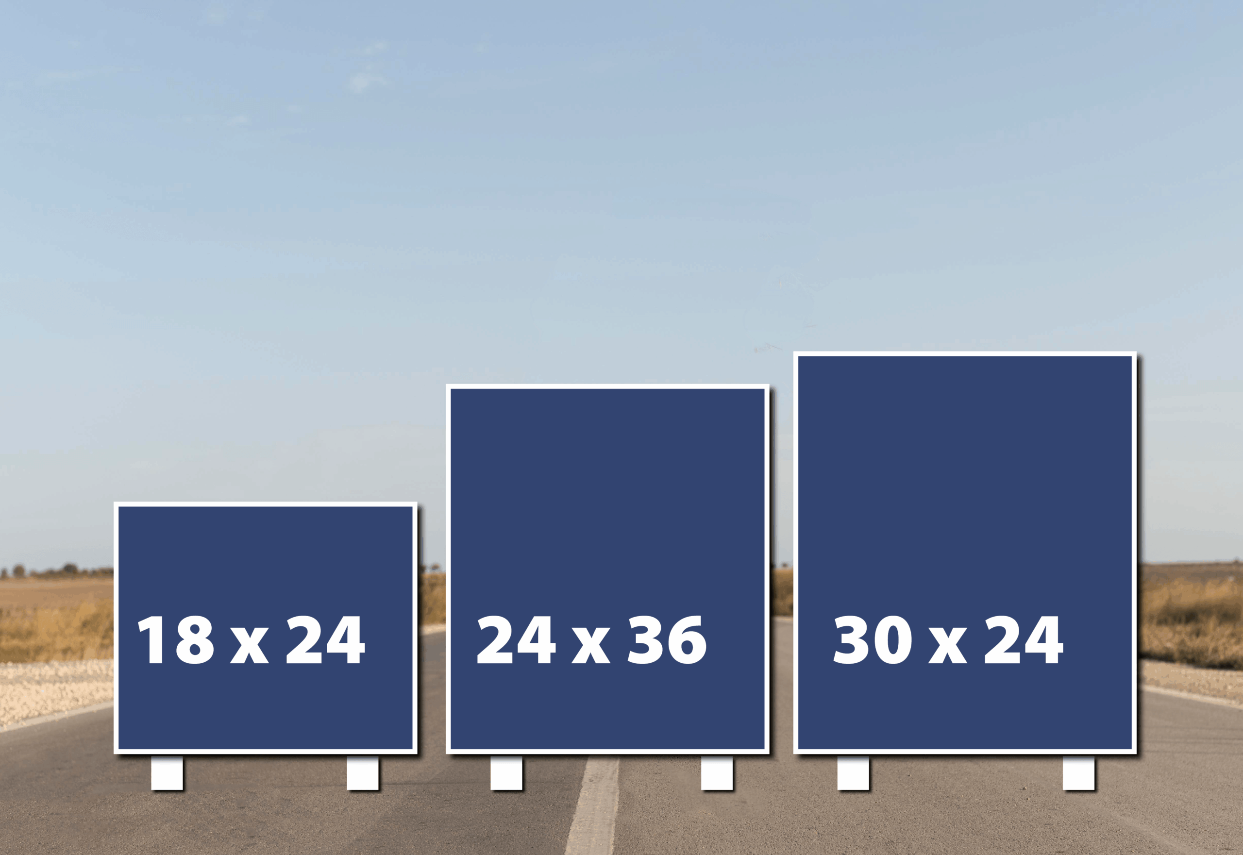
and how quickly the message must be read.
- 18×24 signs work best on residential streets with slower traffic and close placement to the road.
- 24×36 signs improve visibility on busier roads, higher speeds, or properties with longer setbacks.
- 30×24 signs increase headline visibility by adding height without increasing width.
Bigger signs are not automatically more effective. Signs that can be read and understood in under two seconds perform best, regardless of panel size.
Key takeaway: legibility, contrast, and letter size matter more than total square inches.
This article is part of our ongoing Science Series on real-world sign performance. For a broader look at how signage influences visibility, trust, and buyer behavior, see our cornerstone guide on why professionally designed signs still matter in today’s market.
Why Sign Size Matters
Most people don’t stop to study a real estate sign. They’re driving, walking, or glancing up between distractions.
That means your sign has a very short window to communicate.
Visibility is driven by three practical factors:
- Letter height – how large the text appears from a distance.
- Contrast – how clearly the message stands out from its background.
- Time-in-view – how long the sign remains readable as someone passes.
Panel size matters because it affects all three. A larger panel can support bigger lettering and cleaner spacing,
but only if the layout is disciplined. Simply enlarging a cluttered design usually makes the problem worse.
Size creates opportunity. Design determines whether that opportunity turns into calls and showings.
Sign size is just one part of the equation. Visibility, legibility, and trust all work together — topics we explore in depth in our cornerstone article on how effective signage supports real estate marketing from first impression to final showing.
The Three Most Common Real Estate Sign Sizes (And When to Use Each)
18×24 — The Industry Workhorse
The 18×24 panel is the most common real estate sign size. It performs best in residential neighborhoods
where traffic moves slowly and signs are placed relatively close to the road.
 This size supports a clear headline, branding, and a single call to action — as long as the design stays focused.
The biggest mistake with 18×24 signs is overcrowding the layout.
- Neighborhood streets
- Short setbacks
- Standard listings and open houses
24×36 — The Visibility Upgrade
When traffic speeds increase or the sign sits farther back from the road, visibility demands change.
The 24×36 panel supports larger headlines and cleaner hierarchy.
This size isn’t about being bigger — it’s about buying clarity when viewing conditions are less forgiving.
- Busier roads and intersections
- Long driveways or deeper setbacks
- Visually busy environments
30×24 — The Vertical Visibility Upgrade
A 30×24 real estate sign is 30 inches tall and 24 inches wide. This added height improves headline visibility without increasing the sign’s footprint.
The taller format allows key text to stand out more clearly and improves vertical hierarchy,
especially when landscaping or parked cars block lower sightlines.
- When headline visibility is critical
- Designs that benefit from vertical spacing
- Locations where width feels intrusive but height helps
Choosing 30×24 isn’t about making the sign bigger.
It’s about making the message easier to see and faster to read.
How Fast Is Your Viewer Moving?
As traffic speed increases, the time available to read a sign decreases.
As distance from the road increases, lettering must get larger to compensate.
- Slow traffic: 18×24 typically works well.
- Moderate traffic: 24×36 improves clarity.
- Faster traffic: larger headlines and cleaner layouts are essential.
Layout Rules That Matter More Than Size
- One primary message per sign
- Clear visual hierarchy
- Minimal contact information
- High contrast colors
- Intentional white space
If your sign can’t be understood quickly, it won’t perform.
Common Mistakes That Kill Visibility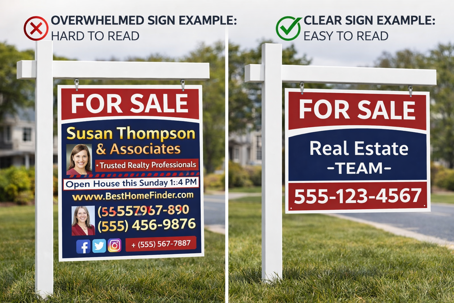
- Too much copy
- Low-contrast colors
- Decorative fonts
- Oversizing without redesigning
Most underperforming signs aren’t too small — they’re too busy.
Quick Size Recommendation Guide
- 18×24: Neighborhood streets
- 24×36: Busier roads or long setbacks
- 30×24: Added height without added width
When in Doubt, Ask Before You Print
Street type, traffic speed, and placement all affect visibility. Sharing those details before printing helps ensure your sign gets noticed for the right reasons.
Next in the Science Series
Science Spinoff #2:
How Big Should the Letters Be? (And Why Most Signs Get This Wrong)
This Science Spinoff series builds on the foundational principles outlined in our cornerstone article, which explains why signage remains one of the most effective offline marketing tools in real estate.
Panel size gets attention — letter size gets results.


0 Comments