The Power of Signs

  • Home
  • Posts
  • Contact

visual hierarchy

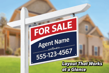
Real estate yard sign with clear layout hierarchy designed for quick readability at a glance.
real estate

Science Spinoff #5: Why Layout Is the Moment Strategy Turns Into Conversion

Layout is not decoration. It’s decision architecture. In The Science Behind Real Estate Signs That Actually Sell Homes, we introduced layout as the silent force behind every effective sign. Here’s the deeper truth: layout doesn’t just influence what people see—it determines how quickly they understand, and whether they act at Read more
By admin, 8 monthsJanuary 29, 2026 ago
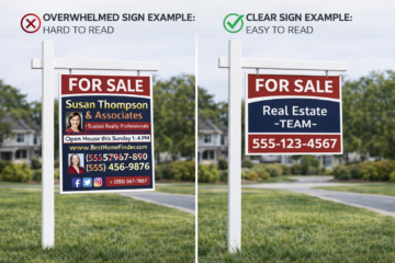
Side-by-side comparison of a cluttered real estate sign and a clear sign showing how information hierarchy improves readability in three seconds
real estate

Science Spinoff #3: The 3-Second Rule: How Information Hierarchy Makes Real Estate Signs Work

1. Three Seconds or You’re Invisible Real estate signs don’t get read. They get glanced at. Drivers are moving, pedestrians are distracted, and attention is constantly divided. In real-world conditions, a sign has roughly three seconds—often less—to register, make sense, and leave an impression. This reality is the foundation of Read more

By admin, 8 monthsJanuary 27, 2026 ago
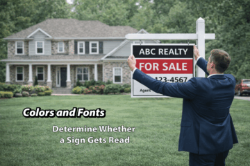
Real estate agent installing a yard sign in front of a home with text overlay explaining how color and font determine whether a sign gets read.
real estate

Science Spinoff #2: Best Color and Font Choices for Readable Real Estate Signs

Best Color and Font Choices for Readable Real Estate Signs Most real estate signs fail for one simple reason: they ask the viewer to read too much, too quickly, under the worst possible conditions. Passing traffic, changing light, visual clutter, and limited attention all work against the message. In that Read more

By admin, 8 monthsJanuary 23, 2026 ago