1. Three Seconds or You’re Invisible
Real estate signs don’t get read. They get glanced at. Drivers are moving, pedestrians are distracted, and attention is constantly divided. In real-world conditions, a sign has roughly three seconds—often less—to register, make sense, and leave an impression. This reality is the foundation of what we call the 3-Second Rule.
If a sign cannot communicate its core message almost instantly, it fails at its most basic function. This failure is rarely about print quality or materials. More often, it comes from ignoring how people actually process visual information while in motion.
2. What the Brain Does When It Sees a Sign
The human brain is wired for pattern recognition, not careful reading—especially when movement is involved. When someone encounters a sign, their brain immediately and subconsciously evaluates it.
In those first few seconds, the brain is trying to answer three simple questions:
- What is this?
- Is it relevant to me?
- Do I need to act right now?
If those questions are not answered quickly and clearly, the brain disengages without hesitation. The message is dismissed, not because it was bad, but because it demanded too much effort.
↑ Back to top
3. Information Hierarchy Explained
Information hierarchy is the intentional ordering of content so the most important message is seen first, followed by supporting information in a logical sequence. It is not about eliminating information, but about prioritizing it.
When hierarchy is applied correctly, the viewer’s eye moves naturally through the sign. Comprehension feels effortless. When hierarchy is missing, the viewer must work to understand the message—and attention drops immediately.
These principles are rooted in how people process visual information at a glance, a concept we explore in more depth in our guide on the science behind real estate signs and visual behavior.
↑ Back to top
4. The Three Layers of an Effective Real Estate Sign
Every high-performing real estate sign follows the same basic structural framework. Information is presented in layers, each serving a specific purpose.
- Primary message: the purpose of the sign
- Secondary message: the authority behind it
- Tertiary information: supporting details
A. Primary Message: The Purpose
 The primary message is the reason the sign exists. Whether it says “For Sale,” “Open House,” or “Sold,” this message must dominate the layout. It should be the largest text on the sign, placed prominently, and designed with strong contrast so it can be read from a distance.
If the primary message cannot be identified from across the street, the sign has already lost its effectiveness.
B. Secondary Message: The Authority
Once the viewer understands what the sign is communicating, the next question becomes who is behind it. This is where the agent name, team name, or brokerage branding belongs.
These elements establish credibility and recognition, but they should never compete with the primary message. Strong branding supports the sign’s purpose. Excessive branding creates visual noise.
C. Tertiary Information: The Details
Details such as phone numbers, websites, QR codes, or rider information should only come into play after the sign has successfully captured attention.
A real estate sign is not a brochure. When too many details are included, comprehension slows and the primary message suffers.
↑ Back to top
5. The Cost of Clutter
Cluttered signs do more than look busy—they actively reduce performance. When multiple elements compete for attention, the brain struggles to prioritize what matters.
Common consequences of cluttered signage include: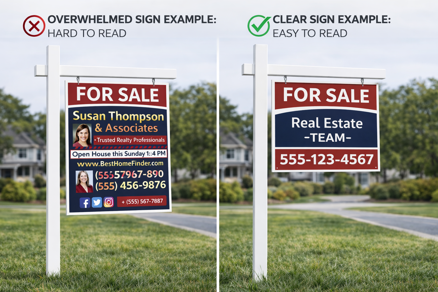
- Slower comprehension
- Missed primary messaging
- Reduced recall
- Lower response rates
The assumption that more information creates more value is one of the most expensive mistakes in sign design.
6. Distance Changes Everything
Effective sign design starts by considering how far away the sign will be seen. At longer distances, only the primary message is readable. As the viewer gets closer, additional layers of information become visible.
Designing a sign starting with close-up readability is a backward approach. Professionals design from the curb inward, ensuring the message works at every stage of approach.
While hierarchy determines what viewers see first, typography determines whether that message can actually be read at speed—especially from a moving vehicle. We explore this further in our article on typography at speed.
7. Visual Proof: Clear vs. Overwhelmed Signs
 When a cluttered sign is compared directly to a clean, well-structured one, the difference is immediate. Clear signs communicate purpose instantly, guide the eye naturally, and project professionalism.
Overwhelmed signs compete with themselves, slow comprehension, and are often ignored entirely. This contrast is not subjective—it is rooted in observable human behavior.
8. Why This Still Works in a Digital World
Digital ads can be skipped. Physical signs cannot. Well-designed real estate signs work continuously, reaching people already present in the neighborhood and reinforcing familiarity through repetition.
In a world overloaded with screens, clear physical signage still signals legitimacy, stability, and momentum.
Practical Takeaways for Agents
Before ordering new signage, agents should evaluate whether their signs pass the 3-Second Rule. A few simple questions can reveal whether a sign is helping or hurting performance:
- Is the primary message unmistakable at a glance?
- Does the branding support the message instead of competing with it?
- Have unnecessary details been removed?
In most cases, improving hierarchy delivers better results than adding more information ever could.
Why the 3-Second Rule Still Wins
The 3-Second Rule is not a trend. It reflects how people have always processed visual information in motion. Information hierarchy is not about design preference—it is about human behavior.
Clear signs outperform clever ones. Order beats excess. And in the real world, three seconds is all you get.
↑ Back to top


0 Comments